Client: Clausthaler
Task: Putting On New Hooves On A Work Horse
Project: Clausthaler Brand Re-Design
Service: Corporate Identity Re-Design, Packaging Re-Design
Category: Branding, Communication
Website: clausthaler.com
They say you shouldn’t wake sleeping giants. But that’s exactly what we did…
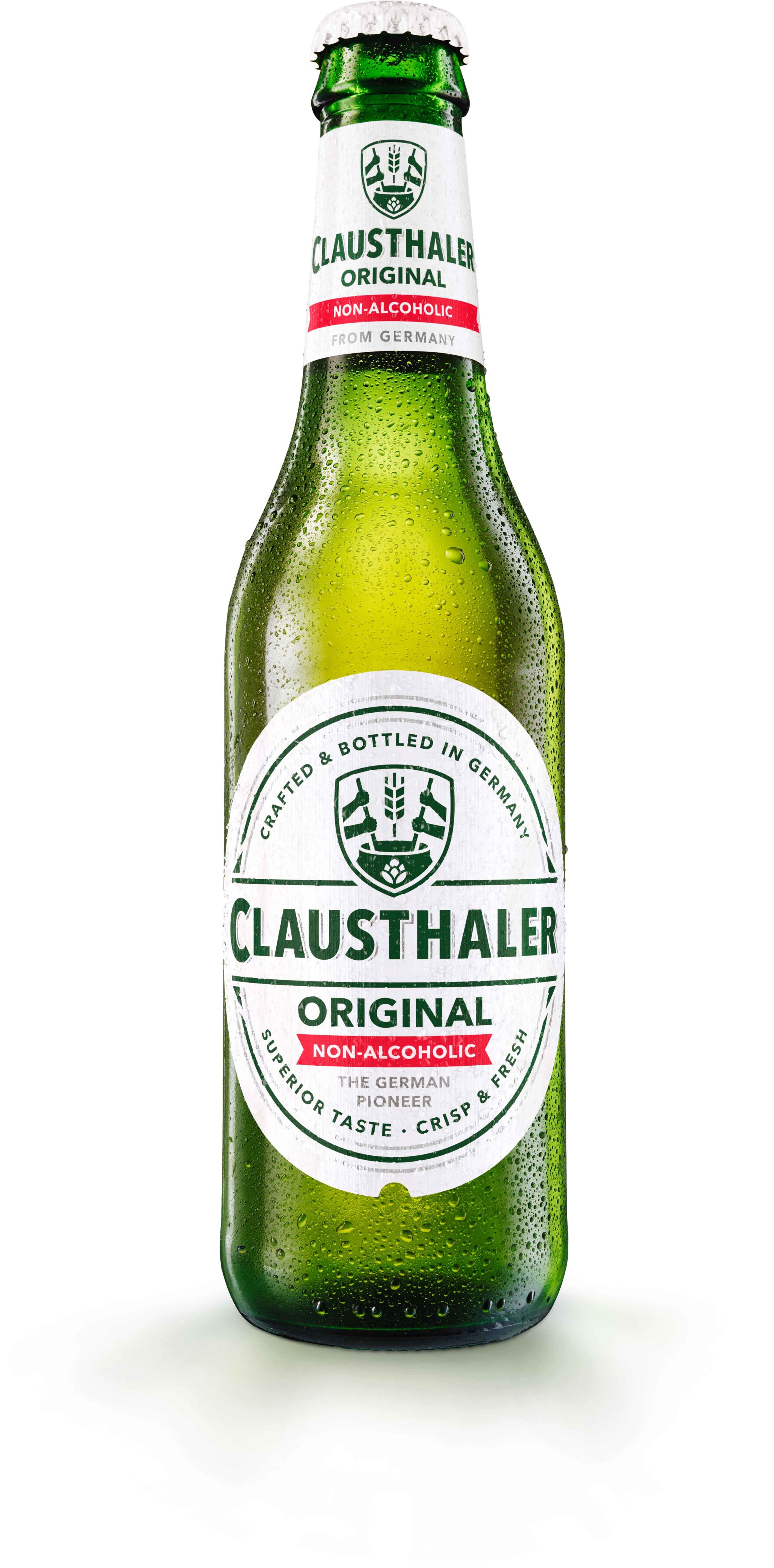
When we were asked to re-design the iconic Clausthaler, we knew it was a monumental task. The brand that invented the N/A beer segment deserves a contemporary look and feel. So we got to work. The task: evolution over revolution.
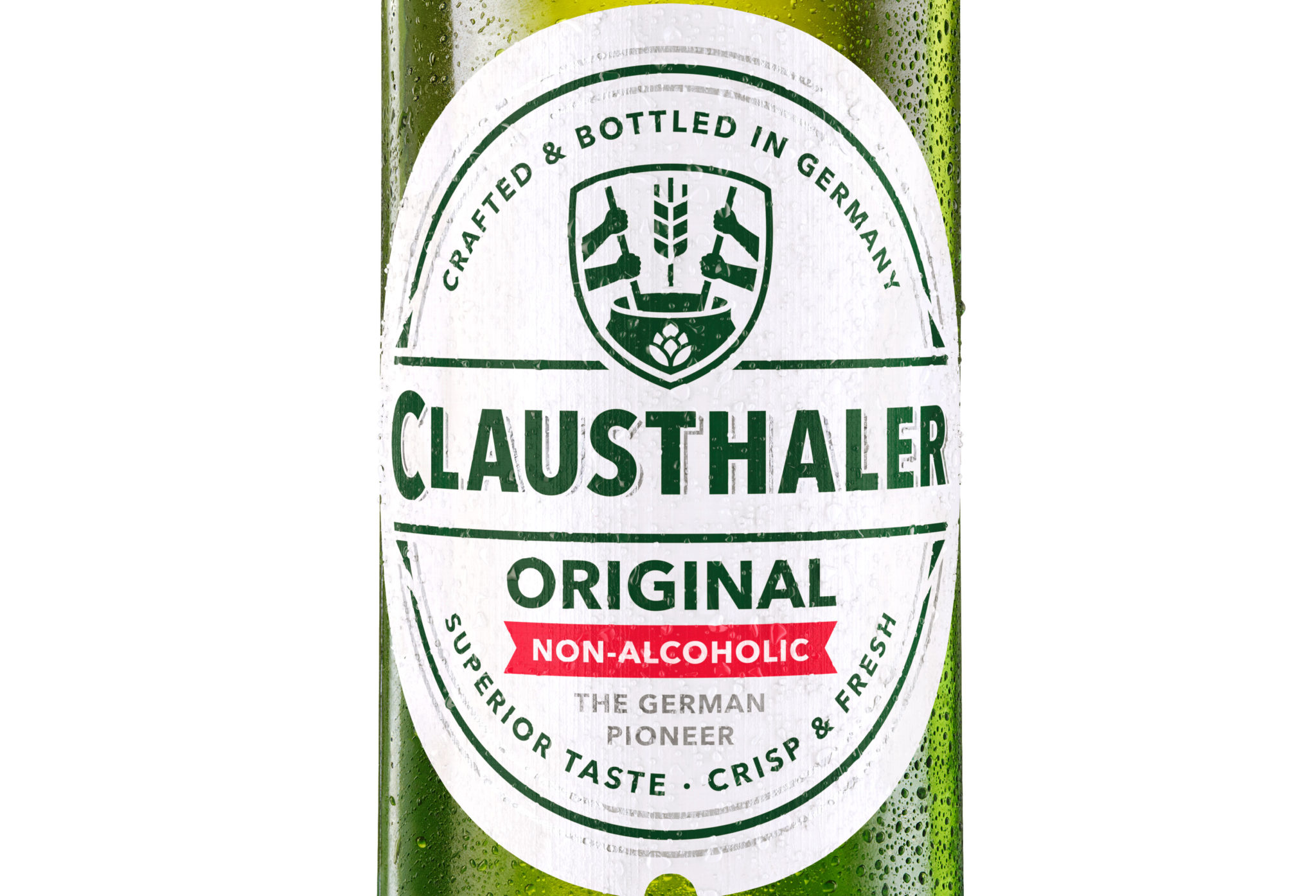
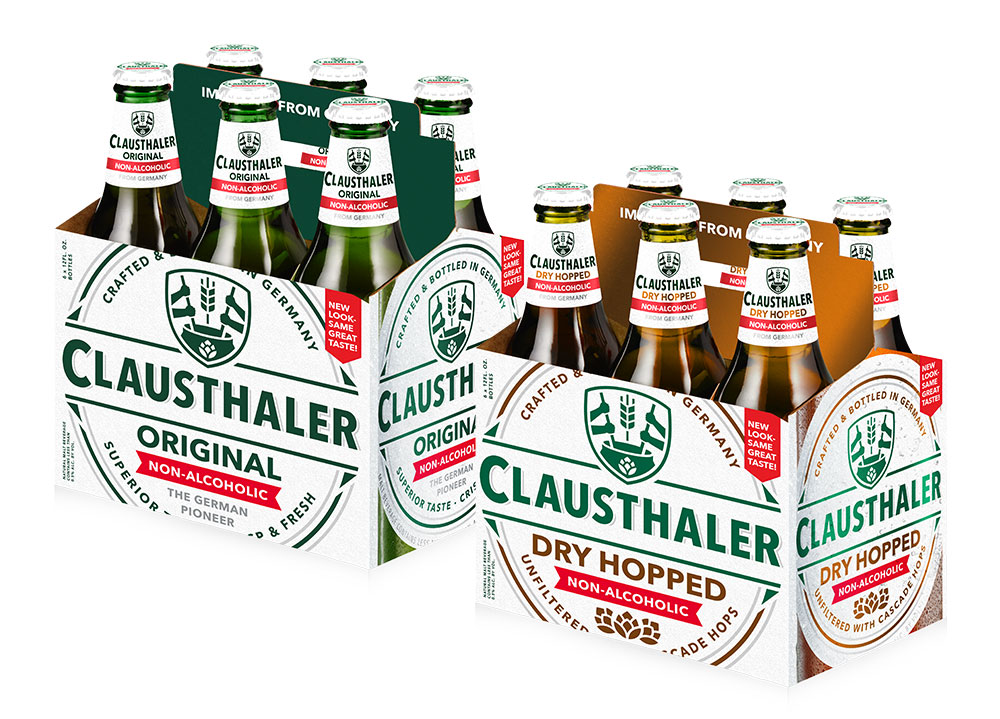
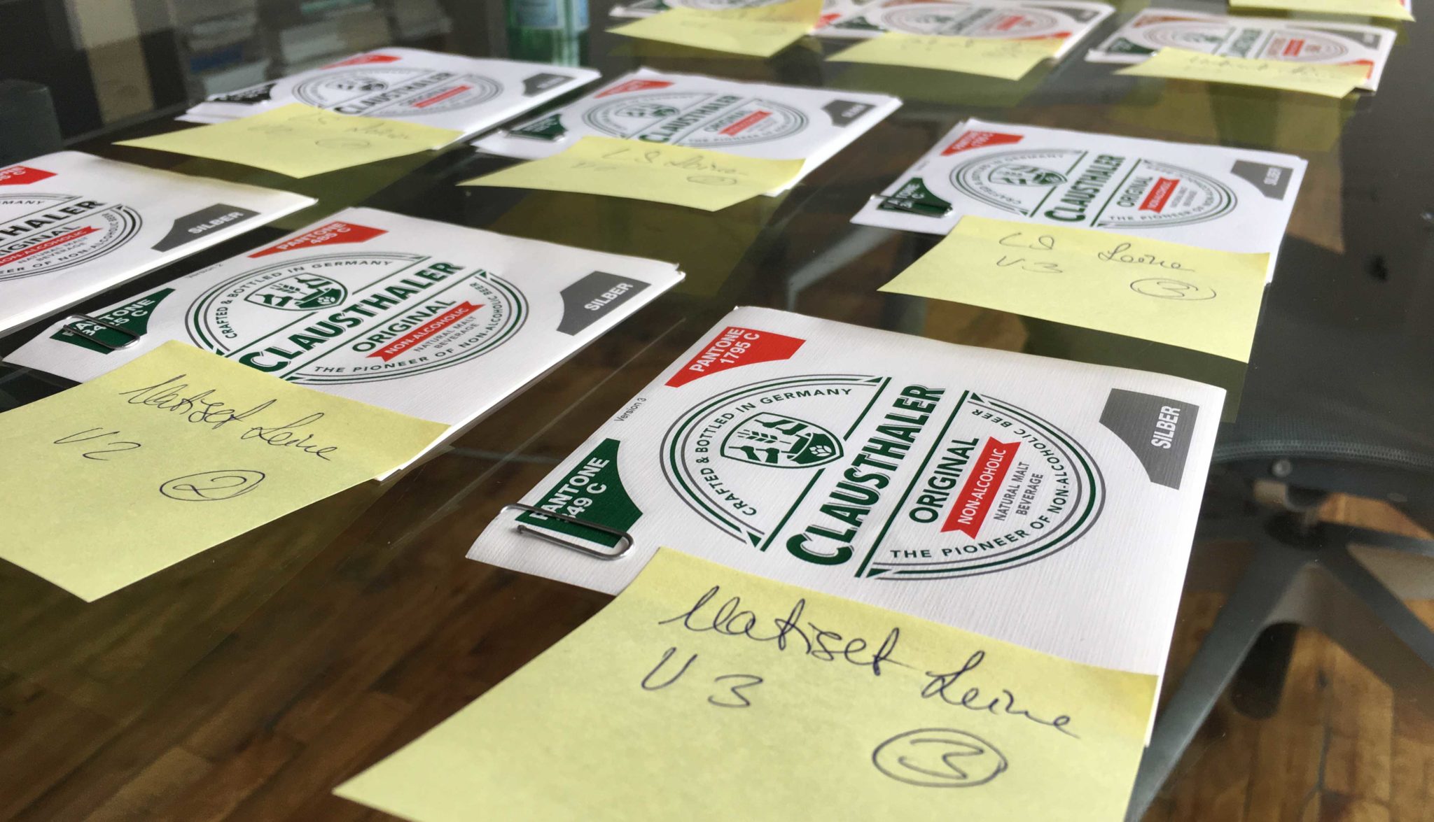
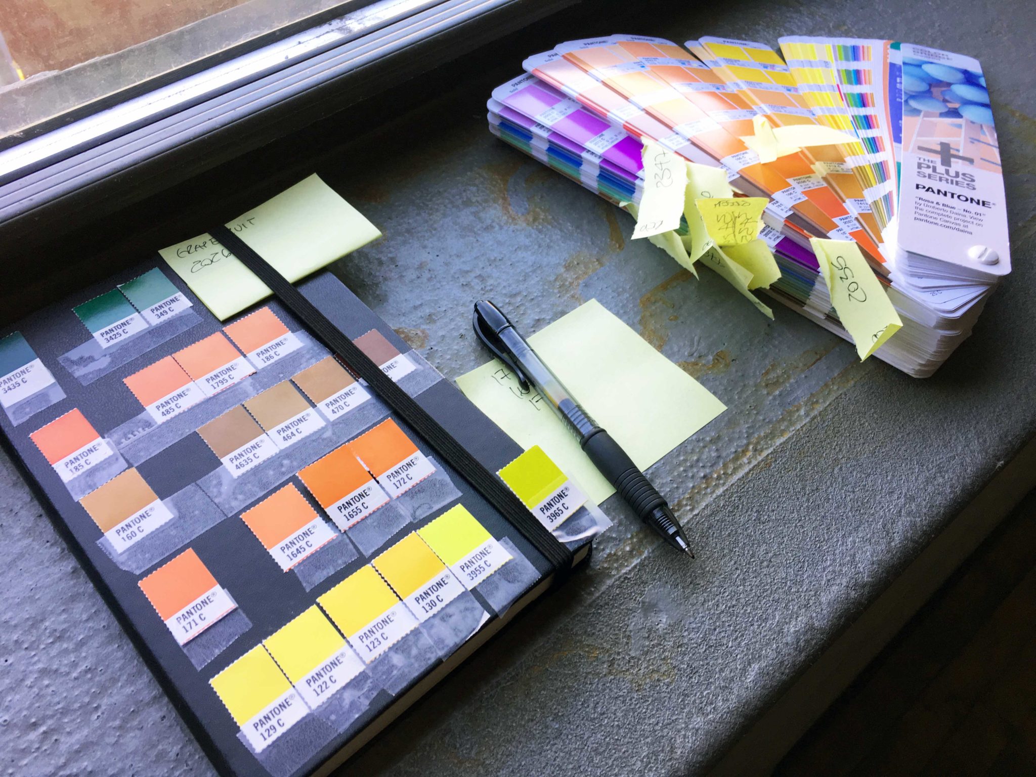
The first thing we did was getting rid of all unnecessary design elements. Knights, medals, outdated symbols? Gone. Wordmark? Sleek, bold, and legible offline and online. Golden drop shadows? No thanks. That ultra dark Green? Freshened up.


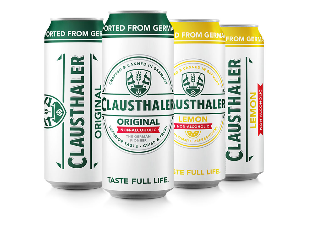
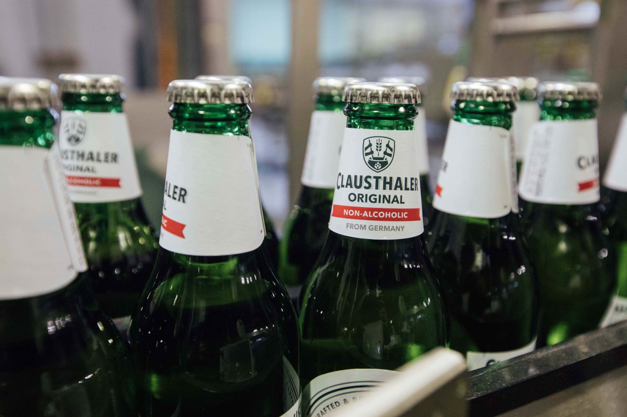
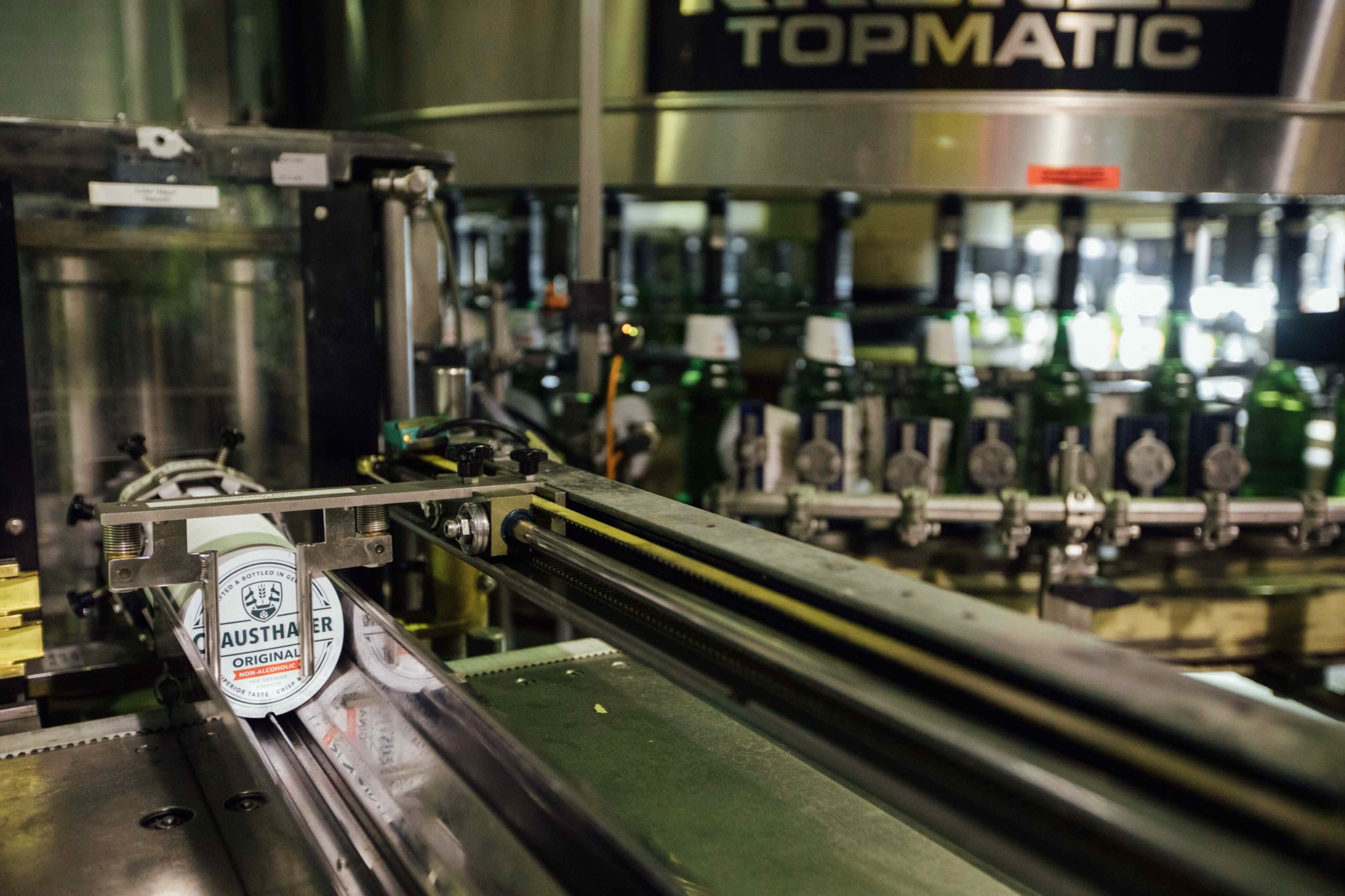
When we say look and feel, we mean look and FEEL. The bottle label got a craftier, natural paper - while the can got a new sleek matte finish.
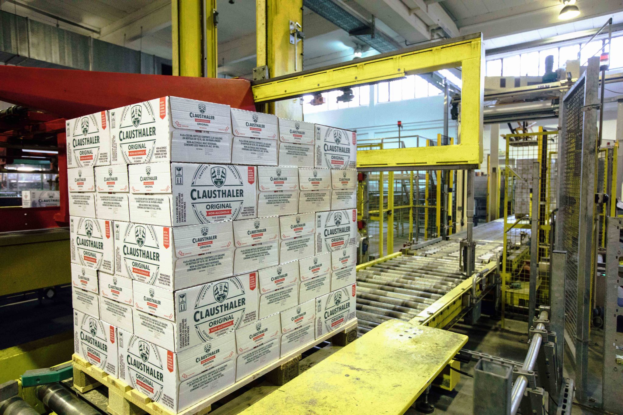
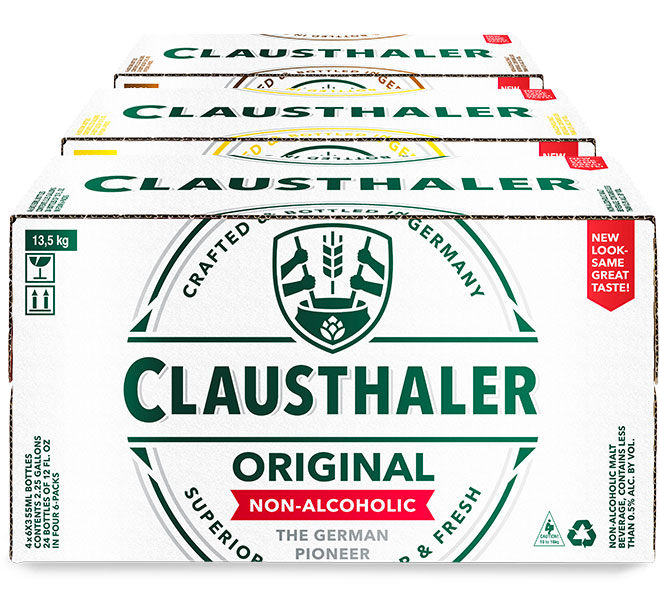
And because you rarely see a bottle or can on its own in the wild, we made sure that our packaging looks good as well.

After all was said and done, we developed a product focused campaign to spread the word.
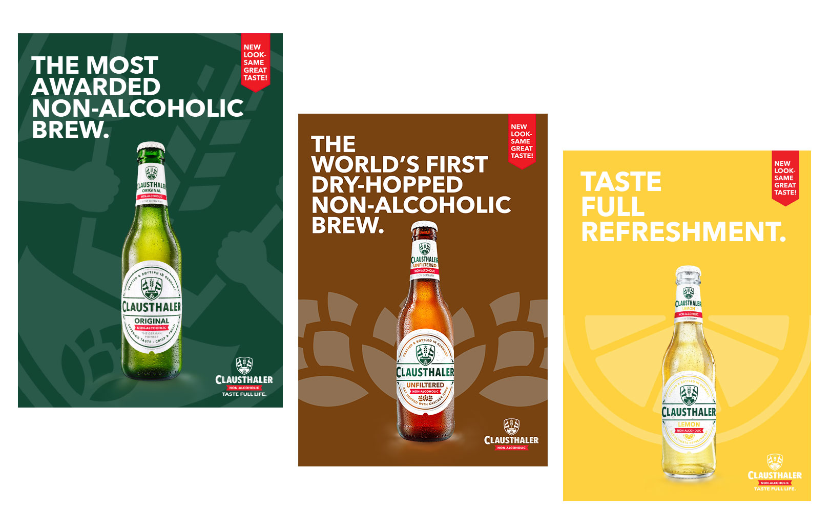
Now that the pioneer is looking fresh in shelves across the world, we can’t wait to see what it will do next. Cheers to the Taste Full Life.
